When I started digging into the UFO Sightings dataset, I wasn’t looking for little green men. I was curious about the patterns hiding behind decades of reports. What people saw, when they saw it, and where they were when it happened. As someone passionate about data storytelling, this project gave me the perfect opportunity to practice data cleaning, visualization, and even some natural language processing (NLP) on real-world, messy data.
What’s in the Data?
The dataset contains over 80,000 reports submitted to the National UFO Reporting Center (NUFORC), spanning multiple decades. Each entry includes:
- Datetime
- Location (city, state, country)
- Shape of the object
- Duration of sighting
- User-submitted comments
- Date posted
Working with it felt like time-traveling through public fascination, from vague lights in the sky to oddly specific shapes like “chevron” or “cigar.”
Data Cleaning: A Crash Course in Real-World Wrangling
I spent a good portion of this project just getting the data into shape. That included:
- Renaming and formatting columns for clarity
- Removing missing values and strange outliers
- Extracting features from free-text fields
- Standardizing time formats and location fields
It’s not glamorous work, but it’s what makes the rest of the analysis possible, and I found myself learning a lot about how to write functions that are both reusable and robust.
Time Trends: When Are UFOs Most Active?
One of the most surprising insights came from the temporal analysis. By grouping sightings by year and plotting the results, I could see clear surges of reports in certain decades, especially around the late 1990s and early 2000s. Whether that’s because of actual sightings or cultural influence (The X-Files, anyone?). It’s fascinating to see how external factors might correlate with spikes in reported encounters.
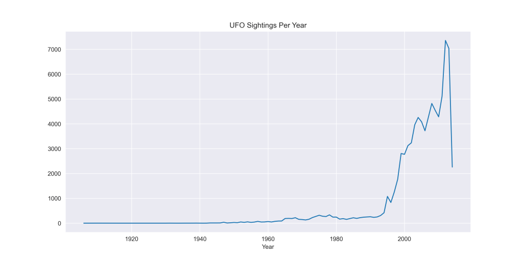
I also examined seasonal trends. Turns out, people tend to report more sightings during summer months, which might have more to do with clear skies and backyard barbecues than alien activity.

Where Are UFOs Being Reported?
Location-based analysis revealed some interesting clusters. Most sightings came from the United States, with states like California, Washington, and Texas leading in total reports. At the city level, Seattle, Phoenix, and Los Angeles had consistently high numbers of sightings.

This kind of spatial analysis helped me think more critically about how demographic and cultural factors might influence what people perceive and report.
Correlation Analysis & Patterns
I wanted to explore whether the type of UFO people report—its shape, in particular—had any relationship to where they were reporting it from. Were some shapes more common in the U.S. than elsewhere? Do certain cities tend to report specific types of sightings?
To test this, I used a chi-square test to assess the relationship between UFO shape and city, and UFO shape and country.
So, what did I find?
- The p-value was approximately 1.0, meaning there was no statistically significant association between UFO shape and either city or country.
- Despite a large chi-square (χ²) value, the matrix was incredibly sparse due to the number of unique cities. This likely invalidates the test’s reliability, even with a large dataset.
- I also calculated Cramér’s V for effect size, which showed a weak to negligible relationship in both city- and country-level comparisons.
- I tried applying Min-Max scaling to reduce skewness and re-test the relationships, but the outcome didn’t change—there was still no meaningful correlation.
Final Takeaway:
There is no strong evidence to suggest that reported UFO shapes vary meaningfully by city or country. This suggests that perception of shape is more likely influenced by individual experience or interpretation than by regional or cultural factors..
NLP Fun: What Are People Saying?
The real goldmine was in the comments field—thousands of free-text descriptions of what people experienced. I used TextBlob to extract sentiment scores from these descriptions, assigning each one a polarity (positive to negative) and subjectivity (objective to emotional).
I also generated a word cloud to see which terms came up the most. Words like “bright,” “light,” “sky,” “triangle,” and “hovering” dominated, giving a quick snapshot of recurring themes.

Lessons Learned
This project wasn’t just about extraterrestrials—it was about building skills:
- I reinforced my understanding of data preprocessing with Pandas
- I explored visualization techniques using Matplotlib and Seaborn
- I applied basic NLP tools to unstructured text
- I practiced saving visual outputs and organizing project files for GitHub
Working with this dataset also reminded me why I love data science: it’s not just about numbers—it’s about stories.
Final Thoughts
I still don’t know if the truth is out there. But I do know that working on this project helped me grow as a data analyst and storyteller. If you’re curious about the code, feel free to explore it here.
Let me know if you’ve ever worked on a quirky dataset like this, or if you have ideas on how to take this analysis even further. I’d love to hear from fellow data enthusiasts!

Leave a comment