
Data Science became my passion in a very unexpected and simple way. It was through an assignment in my Advanced Python class, working with a simple dataset. The dataset contained over a century’s average high temperatures in New York City for January. The goal was to predict future temperature trends, but I learned much more than just numbers along the way. I found patterns, surprises, and an appreciation for data science.
Follow me in my “aha” moment that turned my curiosity into commitment.
I started by loading a dataset of January average high temperatures in New York City from 1895 to 2018. Seeing a record of temperatures over such a long period reminded us of just how much historical data we have, hence the big data term. With the following code, I loaded the dataset and checked the first few rows:
import pandas as pd

# Load the data
nyc = pd.read_csv('ave_hi_nyc_jan_1895-2018.csv')
print(nyc.head(3))
nyc.columns = ['Date', 'Temperature', 'Anomaly']
nyc.Date = nyc.Date.floordiv(100)
nyc.head(3)
In this dataset, each row represented a year and the corresponding average high temperature recorded that January in NYC. As I explored the data, I wondered, “How has the average January high temperature changed over time?”
Before building a predictive model, I needed to split the data into training and testing sets. This approach, called train-test split, helps to test a model’s effectiveness in predicting new, unseen data. I divided the data into a 75-25 split, training the model on 75% of the data and reserving 25% for testing.
from sklearn.model_selection import train_test_split

# Splitting the data for training and testing
X_train, X_test, y_train, y_test = train_test_split(
    nyc.Date.values.reshape(-1, 1), nyc.Temperature.values, random_state=11)

print(X_train.shape)  # Check training set size
print(X_test.shape)   # Check testing set size
For this project, we used linear regression, as a powerful yet simple tool. It fits a line to data, allowing us to predict outcomes based on that line. With it, I could see the potential temperature trends over time.
from sklearn.linear_model import LinearRegression

# Training the model
linear_regression = LinearRegression()
linear_regression.fit(X= X_train, y = y_train)
With the model trained, I was excited to see how well it predicted the temperatures in my test set. By comparing the predictions to actual values, I was able to find out how accurate my model was.
# Testing the model
predicted = linear_regression.predict(X_test)
expected = y_test

for p, e in zip(predicted[::5], expected[::5]):  # check every 5th element
    print(f'predicted: {p:.2f}, expected: {e:.2f}')
With the linear regression model established, I was ready to test its potential by making predictions for future years, as well as estimating temperatures for years we don’t have data for. This lambda function calculates predictions using the slope and intercept of the linear model:
# Lambda function for predictions
predict = (lambda x: linear_regression.coef_ * x +
                     linear_regression.intercept_)

# Predicting future temperatures
print(f"Predict temperature for NYC Jan 1924: {predict(1924)}")
print(f"Predict temperature for NYC Jan 2096: {predict(2024}")
print(f"Predict temperature for NYC Jan 2024: {predict(2048)}")
With a model in hand, it was time to visualize. Using Seaborn and Matplotlib, I created a scatter plot of the historical data and overlaid the linear regression line, bringing visual to the temperature trends.
import seaborn as sns
import numpy as np
import matplotlib.pyplot as plt

# Visualizing the dataset with Seaborn
axes = sns.scatterplot(data=nyc, x='Date', y='Temperature',
    hue='Temperature', palette='winter', legend=False)

axes.set_ylim(5, 70)  # Set y-axis range

# Plotting the regression line
x = np.array([min(nyc.Date.values), max(nyc.Date.values)])
y = predict(x)
line = plt.plot(x, y)

plt.show()
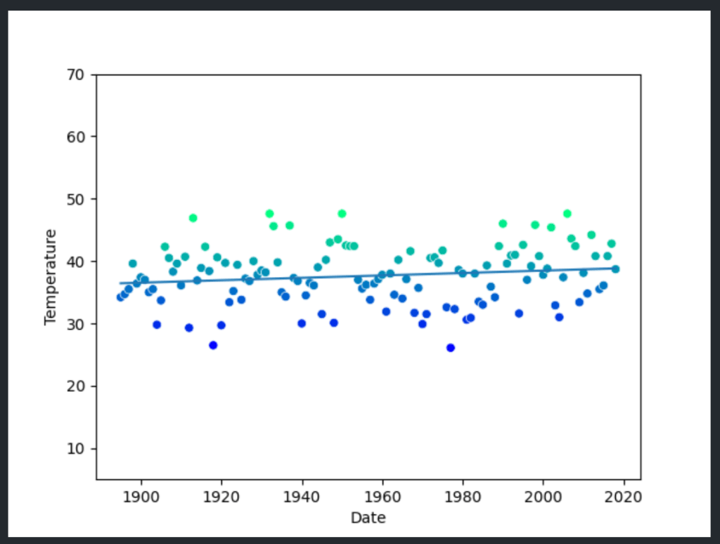
The plot gave me a new perspective. Over time, the trend line suggested an upward trajectory, implying warmer January temperatures in NYC. This single plot, which visually connected over a century of data, illustrated what data science can reveal with a few simple tools and a touch of curiosity.
Although the model demonstrated good overall accuracy, it was eye-opening to see how the results differed from actual, more recent data. The model’s predictions were consistently lower than reality, showing that the historical trend alone didn’t fully capture what was happening in the world today.
For example, when predicting temperatures for a year like 2024 or even further into the future, the model suggested cooler values than what we observe in the actual warming trends. This discrepancy underscores a limitation of simple linear models: they can’t always account for accelerating changes influenced by complex factors, such as global warming.
Climate change is driving temperatures up faster than historical data alone would suggest, reflecting the impact of human activities on our environment. My initial predictive model couldn’t see this surge because it relied solely on past patterns, illustrating the need for more sophisticated modeling techniques to capture nonlinear changes and taking into account carbon dioxide, glaciers and ice sheets melting, change of patterns in plants and animals, etc.
This experience, from loading the dataset to making predictions and visualizing results, sparked my passion for data science. I discovered that data science is more than just numbers and algorithms — it’s a way to understand the world, make predictions, and ask questions that would otherwise go unanswered. Each dataset is a story waiting to be told, and with each analysis, I feel a deeper connection to this field that I now call my passion.

Leave a comment